
Assorted Logos
It all starts with a sketch. Many rounds later it ends up as a logo.

The Hive
My alma matter started a design incubator for the students. If they had that when I was a student, I definitely would have majored in media studies and not art history. I drew out the logo, painted and scanned the hive bug lots of times to get to the right hive combination. The bottom two logos where what was approved. At some point, the type face changed and a pentagon was added.
All I will say is, logos evolve- but this is not an evolution I like. The shape takes the energy that the mark was supposed to convey and kills it with the pentagon. The blocky type gives the mark a heavy and masculine feel. Oh well. The project was fun and I was happy to give back to Pomona College.
SRG Senior resource group.
Retire in style at a SRG retirement community. Designed the main logo along with two secondary marks.
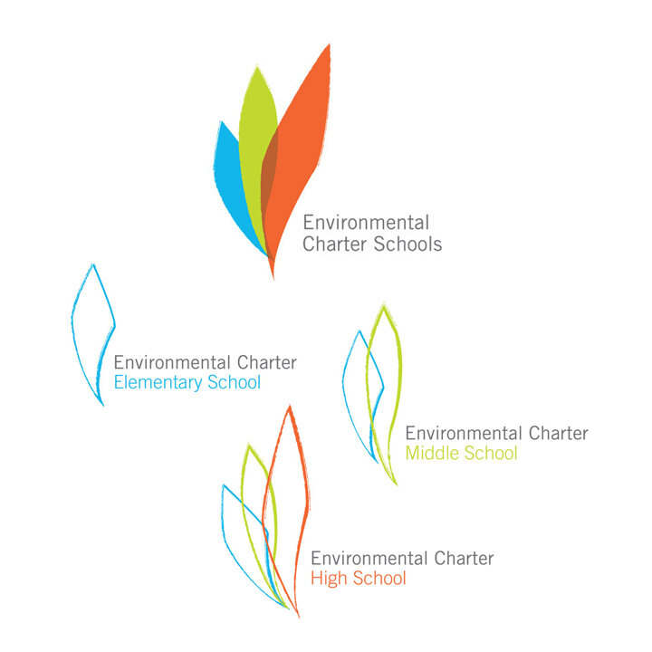
ENVIRONMENTAL CHARTER SCHOOLS
As the name implies, a group of charter schools in Los Angeles county with a focus on the environment. One of the toughest clients I have worked on. I not only needed buy off from the principal and the board, but the faculty as well. I also wrote up a comprehensive
64 page document of how to use the mark. Lesson I learned from this project was that a 64 page pdf documenting the usage of a mark is rarely followed by anyone. Taught me to keep my branding documents simple and to the point.

Charlemagne FINE WINES
Boutique fine wine distributor needed a logo for his new company. This particular distributor travels through Italy, France and Spain looking for small wineries that may not have a lot of representation outside their home regions. Client wanted something classic. Took out my pens and hand lettered the logo. Loved it. Don’t have many chances to create something by hand these days.