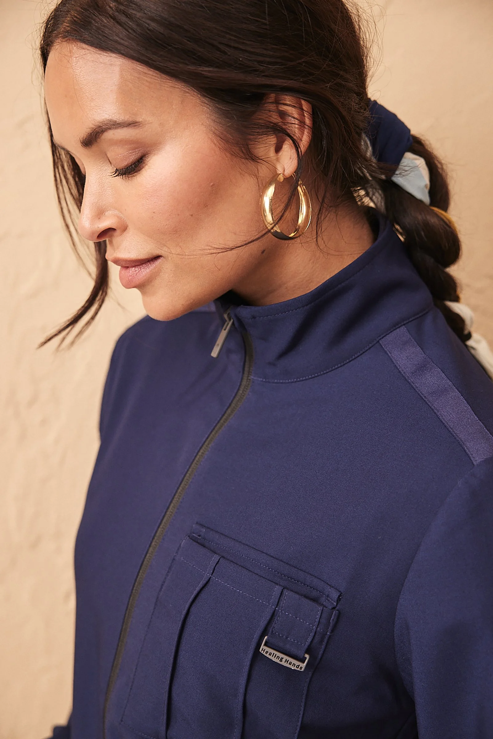
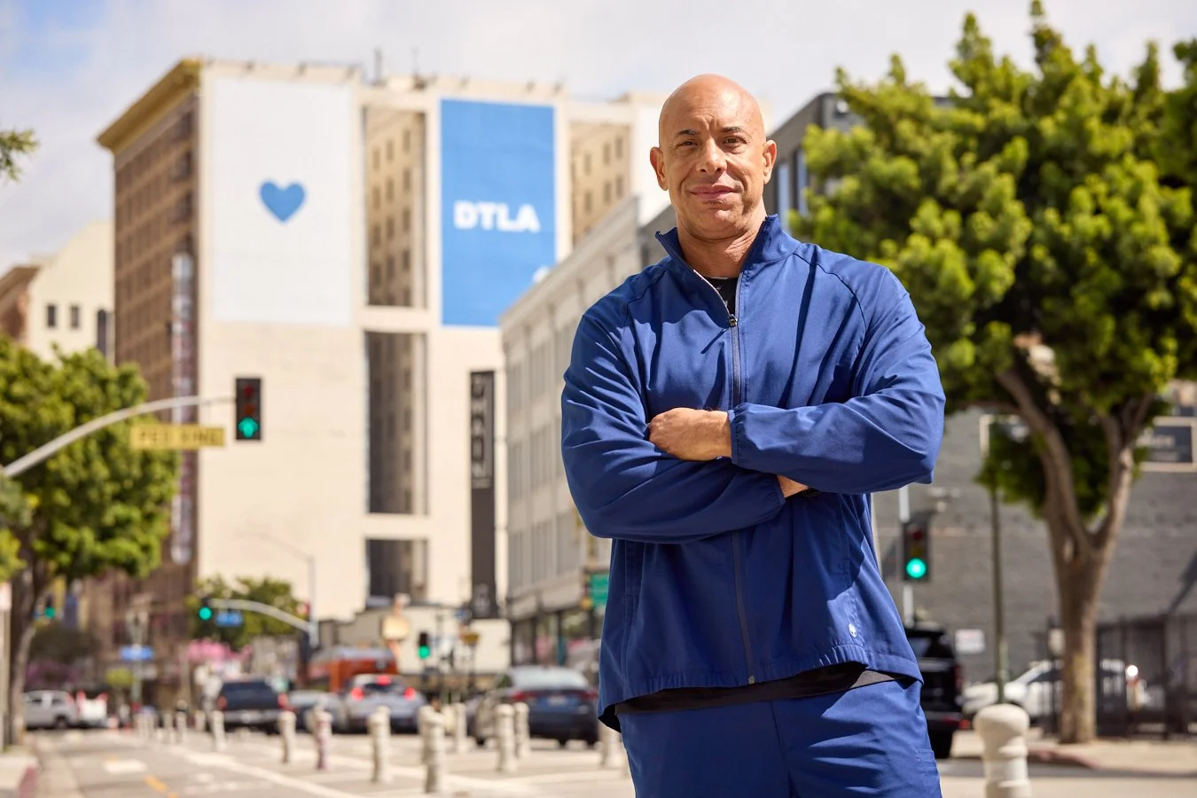
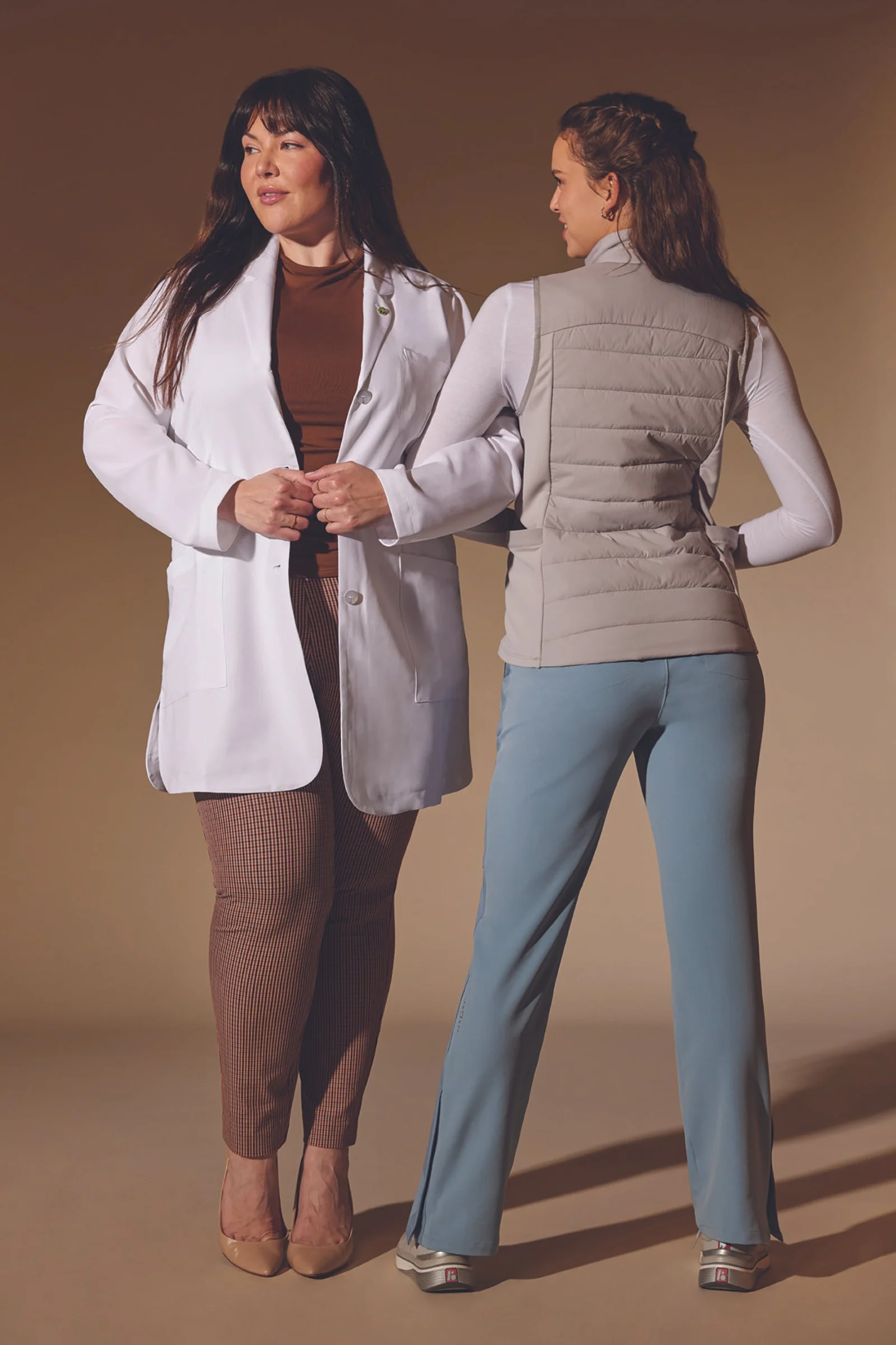
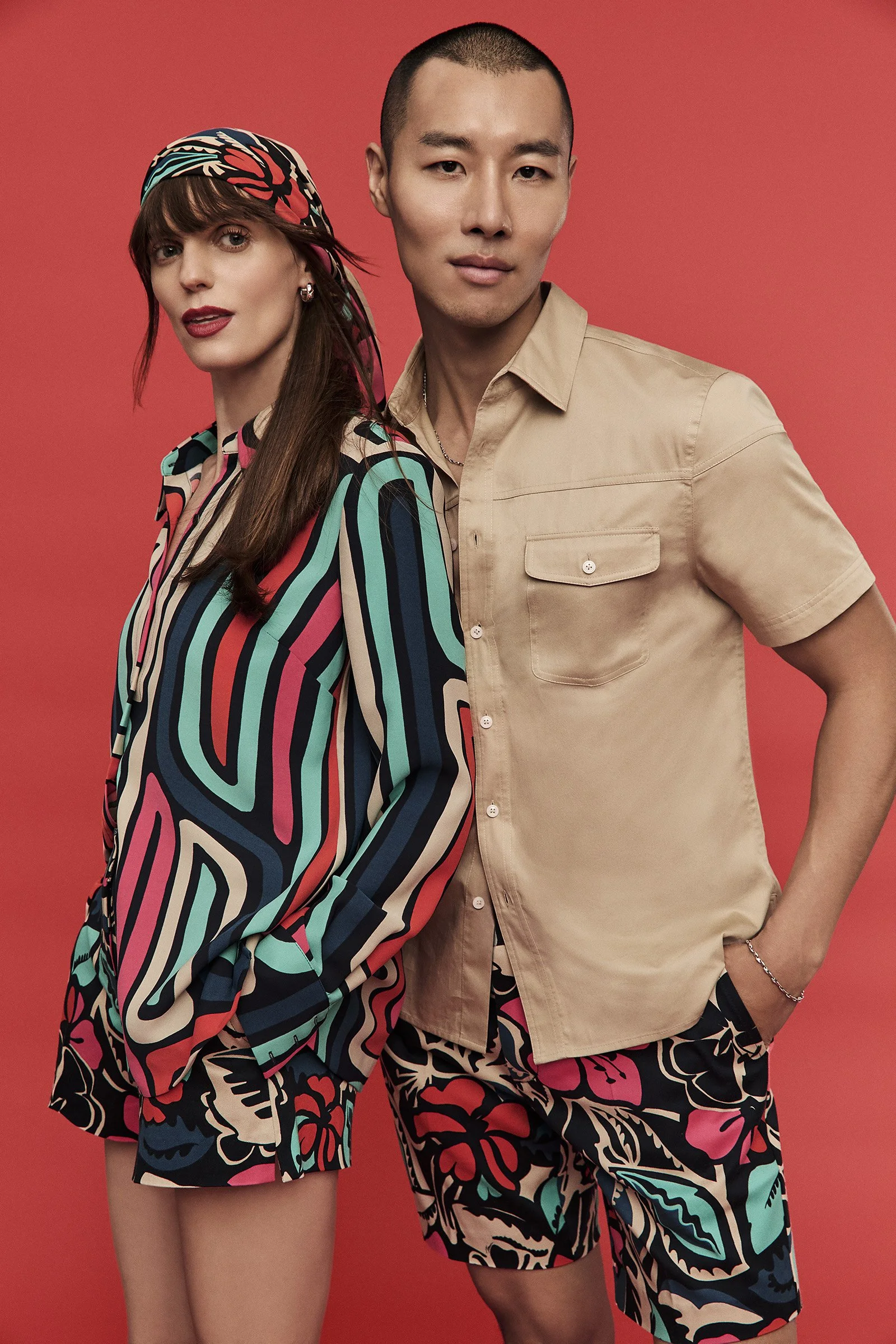
welcome to tinyshinyrobots. what is tinyshinyrobots? it’s a business. it’s a portfolio. it’s both. it depends on what my current employment status is. do i want to be employeed or freelance? it depends. i do like working to the melodic sounds of squirrels fighting for peaches outside my home office window. i also like the sweet smell of office, the hum of printers and people fighting over the last doughnut on doughnut fridays. i'm pretty flexible. i design and art direct. i am comfortable with both print and web. Scroll sideways to see stuff.

Nissan Juke Studio homepage

www.NissanJukestudio.com :: 3 artists, one cool car. Design your own cool wrap and win an all new 2011 Nissan JUKE. FWA and Creativity top site of the Day, March 2011. We also made four videos, one to explain the program and three about each of the artists. Click below to watch.
What is Juke Studio? | Jim Mahfood | Tristan Eaton | Jeremyville
www.secretagentpr.com:: Small PR agency needed a simple site. I also designed the logo.
2008 Nissan Cube email:: Getting Nissan handraisers excited about the boxy-cute Nissan CUBE.
2011 Infiniti enewsletter:: After 3 years, it was time for a fresh new look.
CLICK HERE TO SEE FULL VERSION
2011 NISSAN eNewsletter:: CLICK HERE TO SEE FULL VERSION
NISSAN Owner Communications program :: Over 18 different cars plus three different customer bases plus various different offers equals one large direct mail program. Every square inch of this is customizable- except for the images. They are currently working on that.
2008 Islands Restaurants:: www.youdeserveislands.com:: A Southern California chain of Hawaiian themed restaurants wanted to appeal to a younger demographic. Why not appeal to the slacker inside. Inspired by airplane emergency brochures.
2011 Nissan Fleet Brochure:: Nissan Fleet wanted a simple to read brochure highlighting their top selling fleet vehicles and introducing their latest addition to the Fleet family, the Nissan NV. (above) front and back of brochure
(above) inside of brochure
(above) Left side can be opened to reaveal a detachable third panel. There is a pocket on the right hand side that holds four cards. The first card is the Altima, the best selling Nissan Fleet vehicle. These cards are two sided. Front shows vehicle and tag. Back is car specs.
(above) Altima card, front and back
(above) Rogue card, front and back
(above) Sentra card, front and back
(above) Versa card, front and back
Goldenvoice/Art Show present HIM:: Severed baby doll heads are always a winner.
House of Blues/XBox360 present the Fray:: Grateful for their first pro poster.
2011 Nissan NV Line Up- Prelaunch Brochure:: My first full vehicle launch. My copy partner and I can sell them in our sleep. Or at least I can. (above) front and back of brochure.
(above) Inside of brochure. Left side has two perforated tabs. Right side gives a brief description of the Nissan NV vans.
(above) Pull the tab in the center of the left side to break the perforation. Behind the doors there is an image of the van with its rear door open. The two panels represent the two sides of the van- office and work.
Pioneer Print Campaign-Magazine/Newspaper ads:: Seeing and hearing like never before pretty much sums it up.
Pioneer Direct Mail Accordian Fold:: Spending money like never before. This accordian fold was fun to concept and build. In the end, the brochure was never produced in this format because we couldn't find a printing press that could print sheets over 80 inches in legnth. The accordian was converted to a booklet and matching postcards instead.
(left 1 and 2 ) front of the accordian fold (right 3 and 4) back of the accordian fold
(one)
(two)
(three)
(four)
theguide.com- LA Times:: I've lived in the greater Los Angeles area for over 15 years, and I admit, I have never seen the canals in Venice or explored all of the culinary delights Japantown has to offer. Most Angelenos (native or transplants) are guilty of the same. The purpose of this campaign was to raise awareness of all the wonderful things LA has to offer, without getting on a plane.It is done in the style of 1930's and 40's travel posters. This was a fun campaign to work on. My favorite was creating the little stamps for each LA region.
American Cancer Society-Youth Cancer Awareness Campaign:: This was strictly a web based campaign, due to financial constraints. The campaign was based on the common complaint against volunteering by people 18-30, lack of time. We wanted to show this group that doing good didn't require insane amounts of your day. A litle bit of time goes a long way in the fight against cancer. This campaign consisted of web banners and email blasts.
DeLab:: Fundraiser for the Neutra house:: Neutra in most designers brains conjures up that nifty typeface by House Industries. But to diehard modern architecture afficianados, it's a beautiful house in the heart of Silverlake. DeLab (Design East of LaBrea) hosted a fundraiser to raise awareness and keep this architectural gem open.
www.com_dyn.com:: Community Dynamics :: Located in Southern California, this firm builds mixed use and residential structures. Their website desperatly needed a design overhaul. Clean, spartan, no bells and whistles.
Show Your Stubs:: COMPLEX and Toyota :: This was my very first project with Complex Magazine. The term show more sheet metal had not entered my vocabulary. It's a good thing too.
Courvoisier and Complex present: The Guide to Manhood:: This was one of many microsites I created for Complex. It's pretty self explanatory. The title cracks me up. Liquor microsites always had to look like a club flyer. I enjoyed coming up with the content (the 3 Cs- clothes, chicks and clubs) and mixing the suggested cocktails. This one isn't that great.
TCW:: www.tcw.com:: In 2006, TCW got tired of their stodgy old site. They wanted something not so blue. They wanted warm and fuzzy investing. They wanted to see people.
TCW 2006 Annual Report:: They liked the new look of the website so much, they decided to use it in the annual report. First photoshoot I got to direct. First photoshoot I learned that the Creative Director gets to travel on out of state shoots, and you the mid level art director do not.
La Canada Wine Labels:: Designer fantasy jobs- working at French Paper on paper sample catalogs and cranking out wine labels. Have done one out of two. Still waiting for my bottle. It must have been terrible wine.
House of Blues 2 color drink coasters:: One thing I loved and hated about House of Blues was the lack of funds for photography. (arrrgh) No photography budget meant I got to play illustrator. It's my dream to do illustration full time.