LA DESIGN FESTIVAL
OVERVIEW
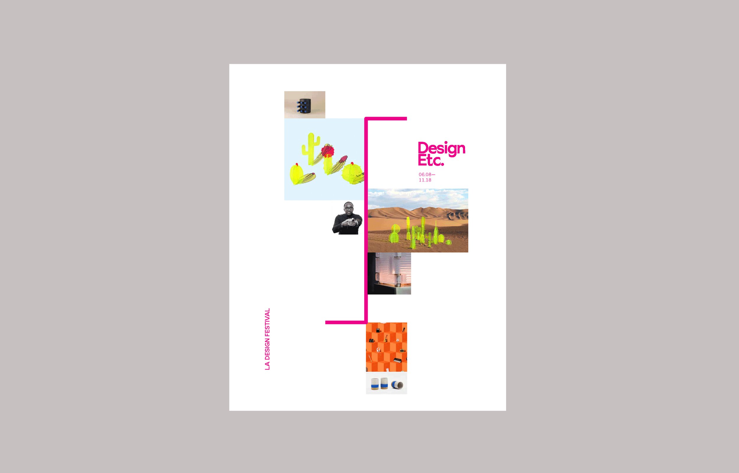
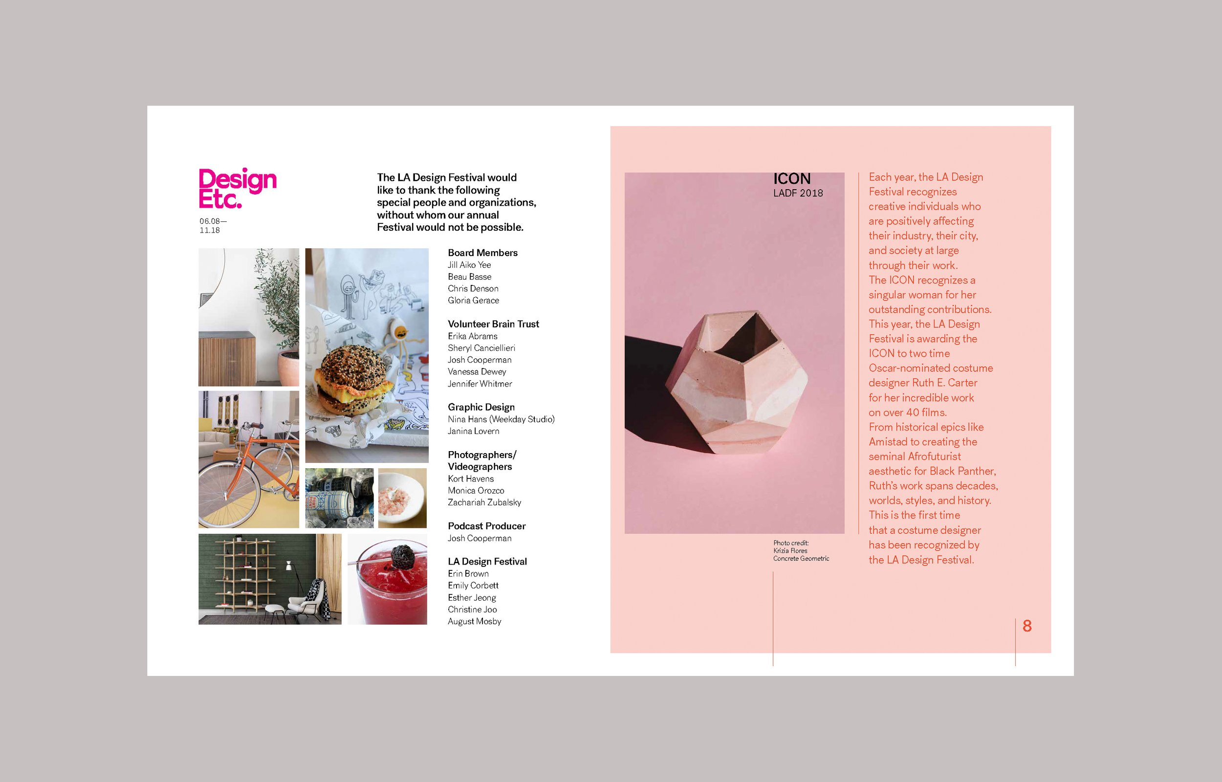
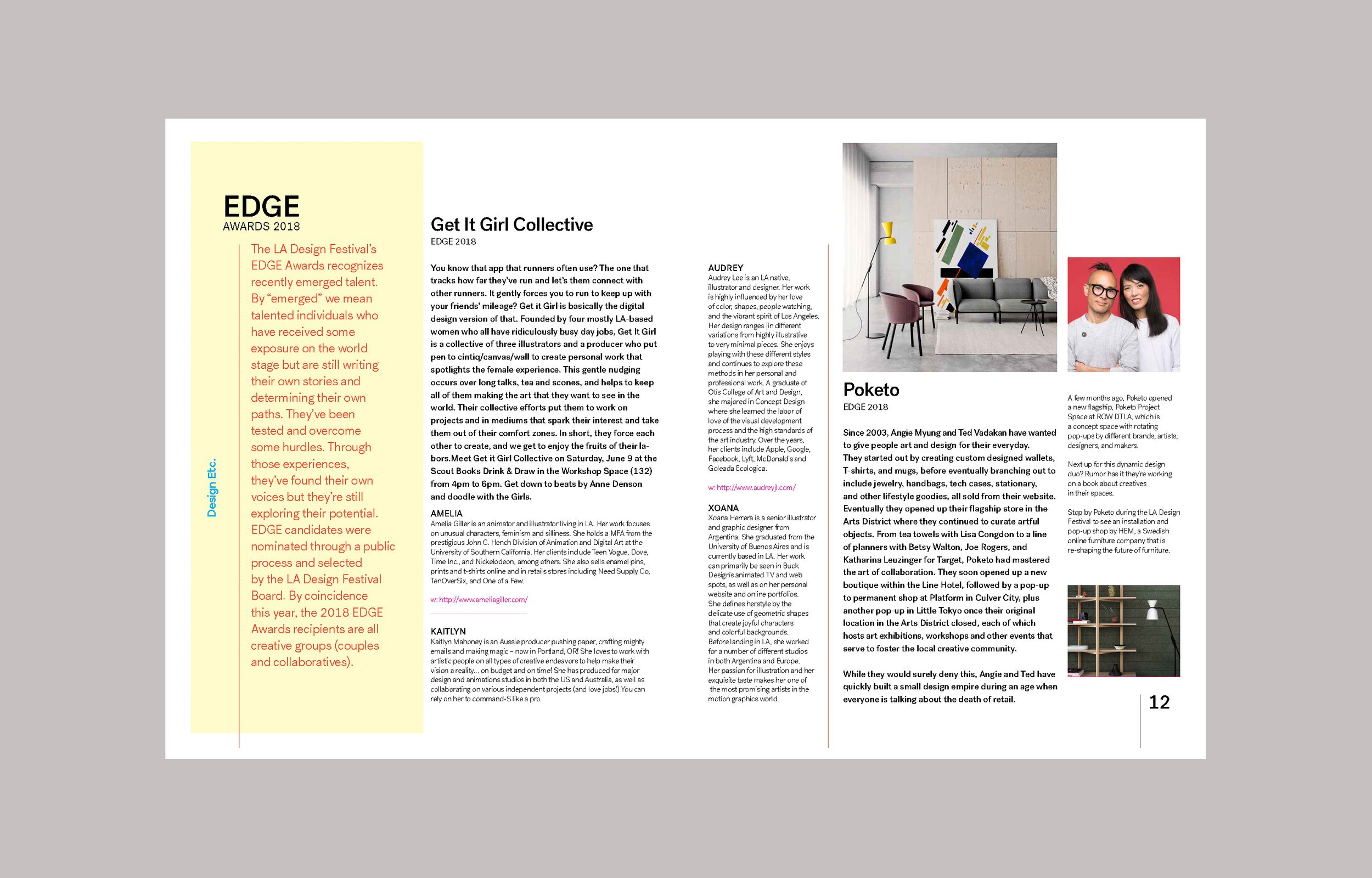
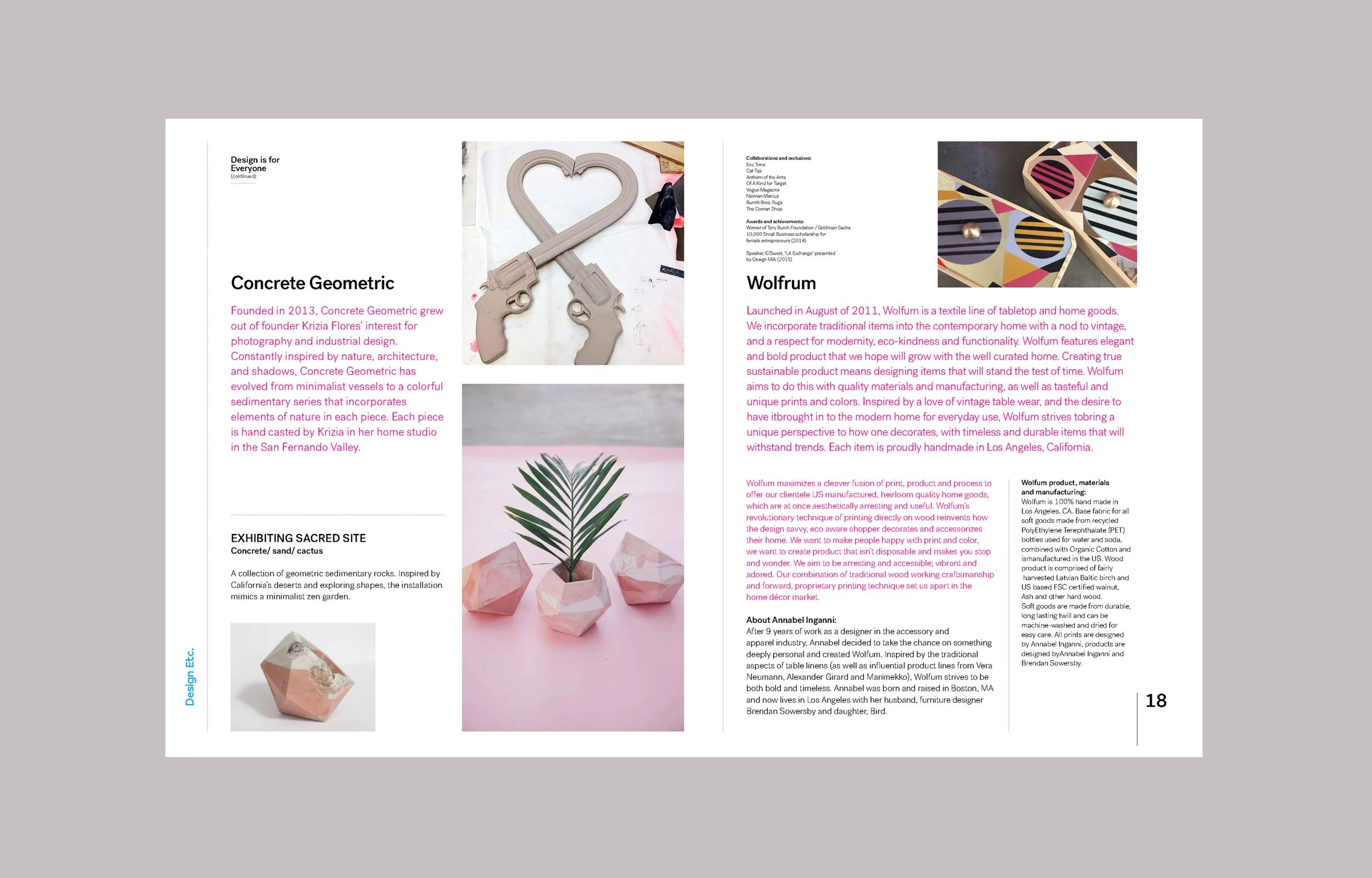
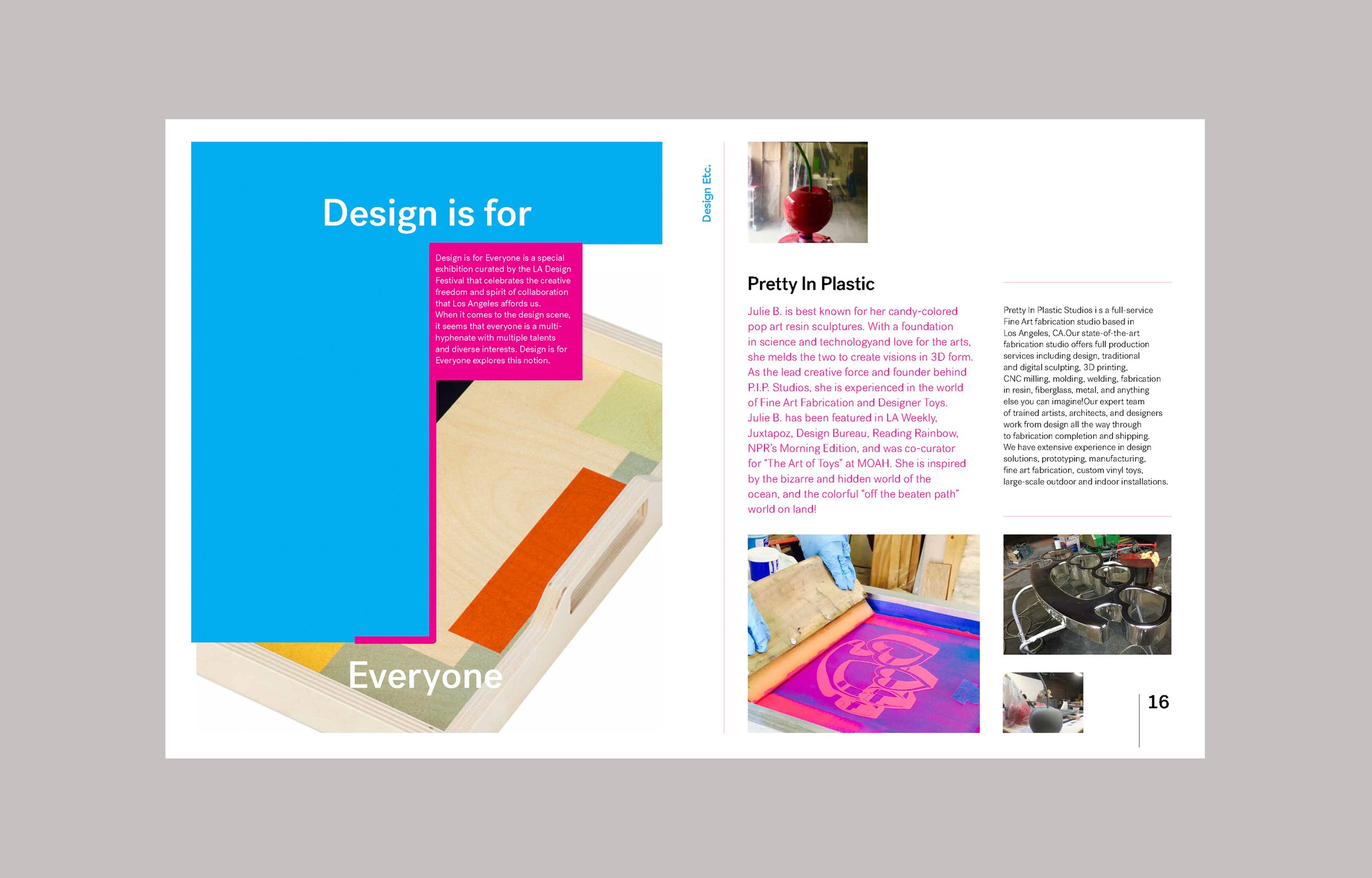
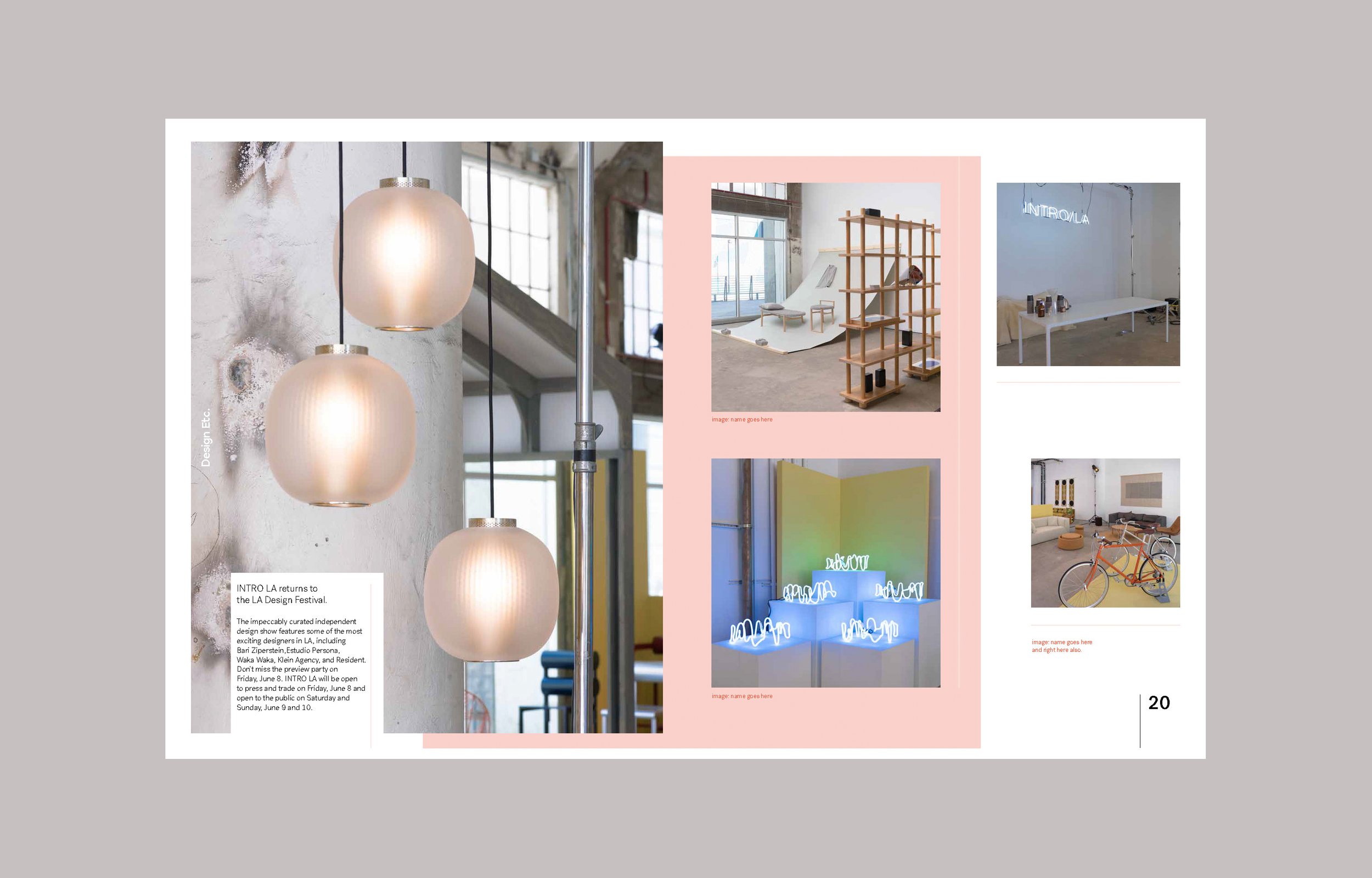
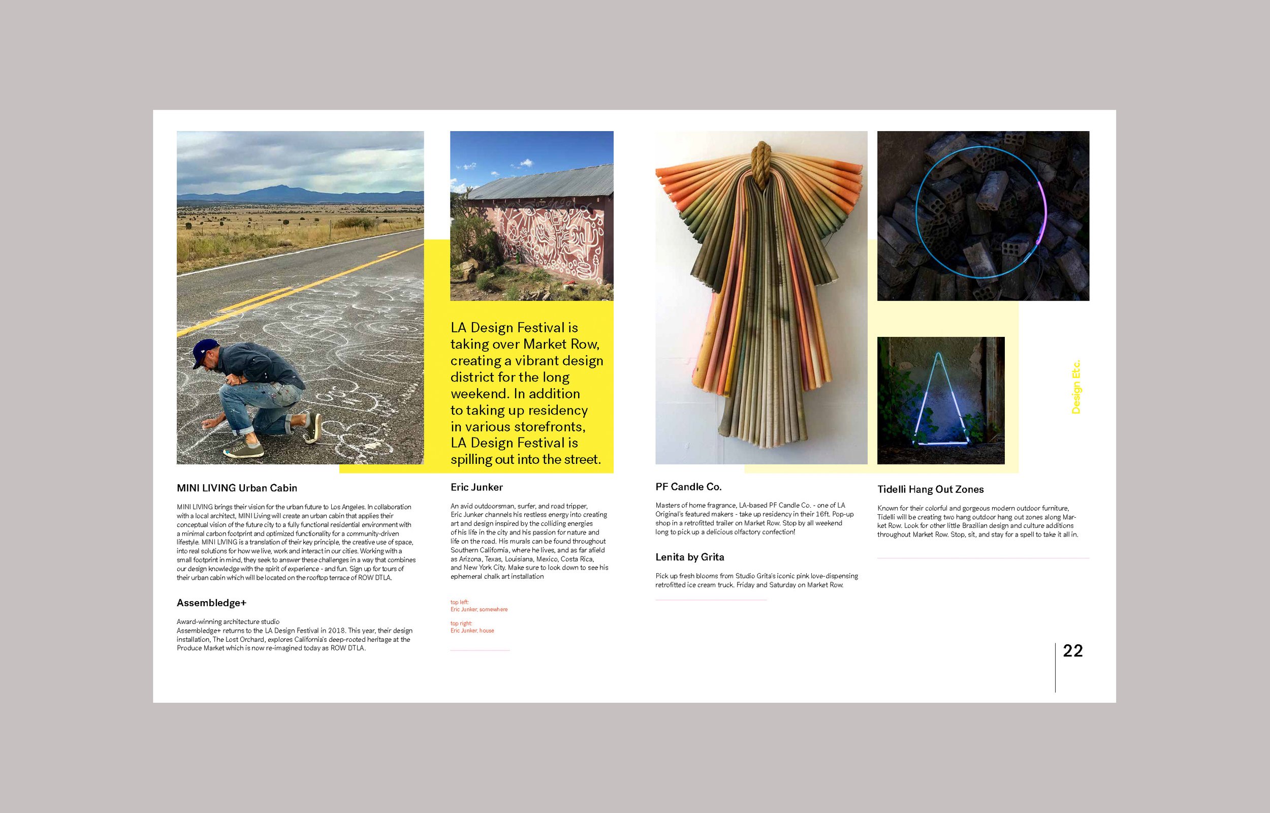
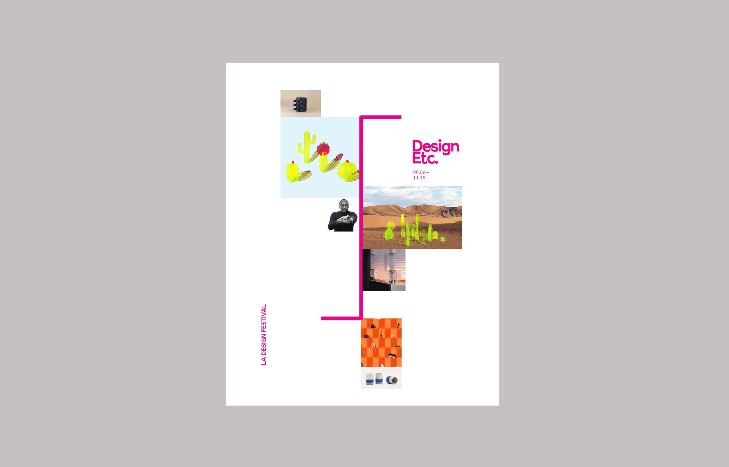
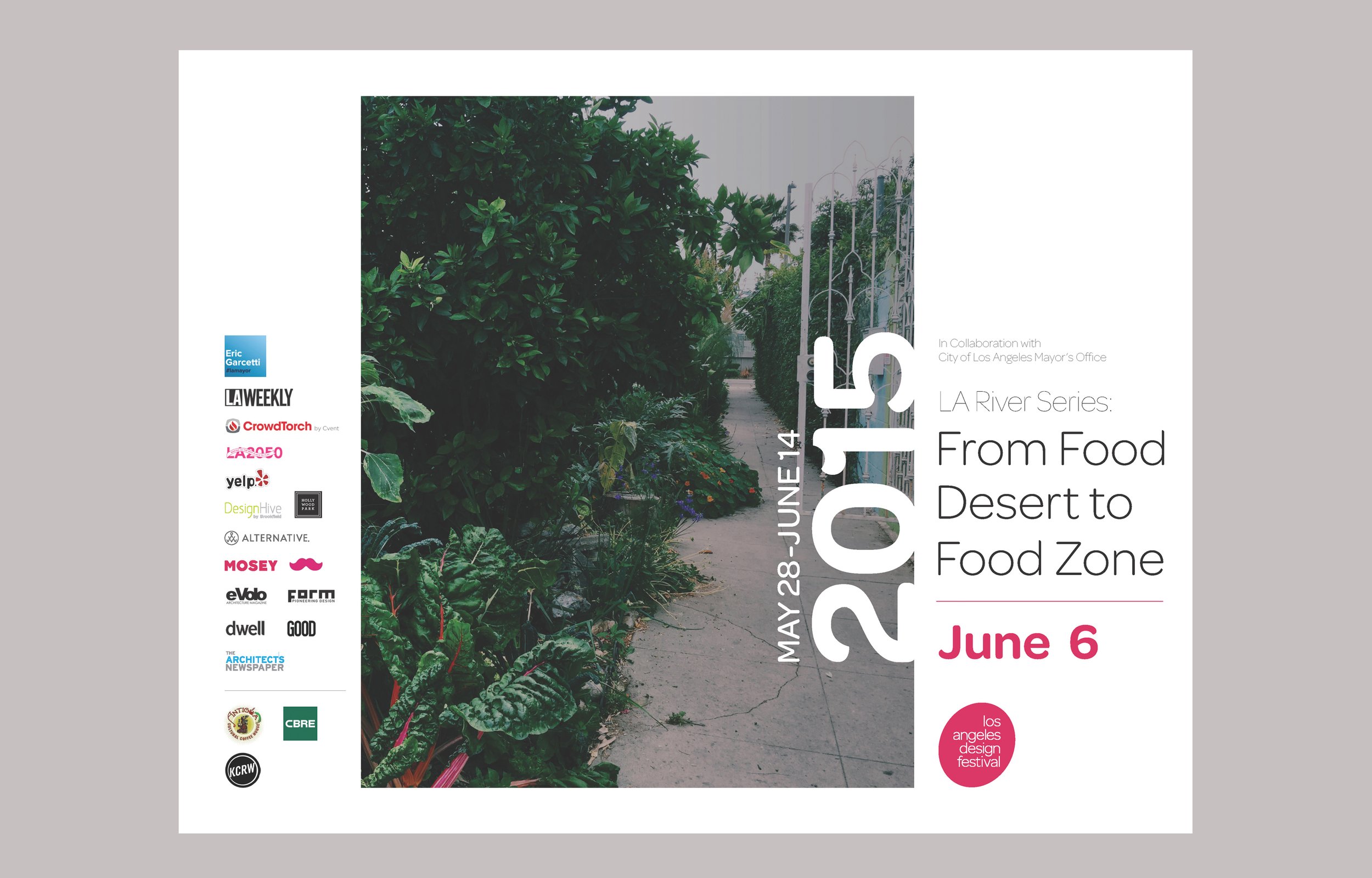
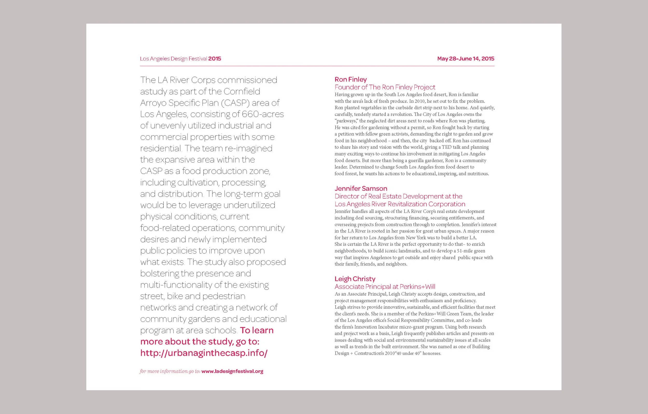
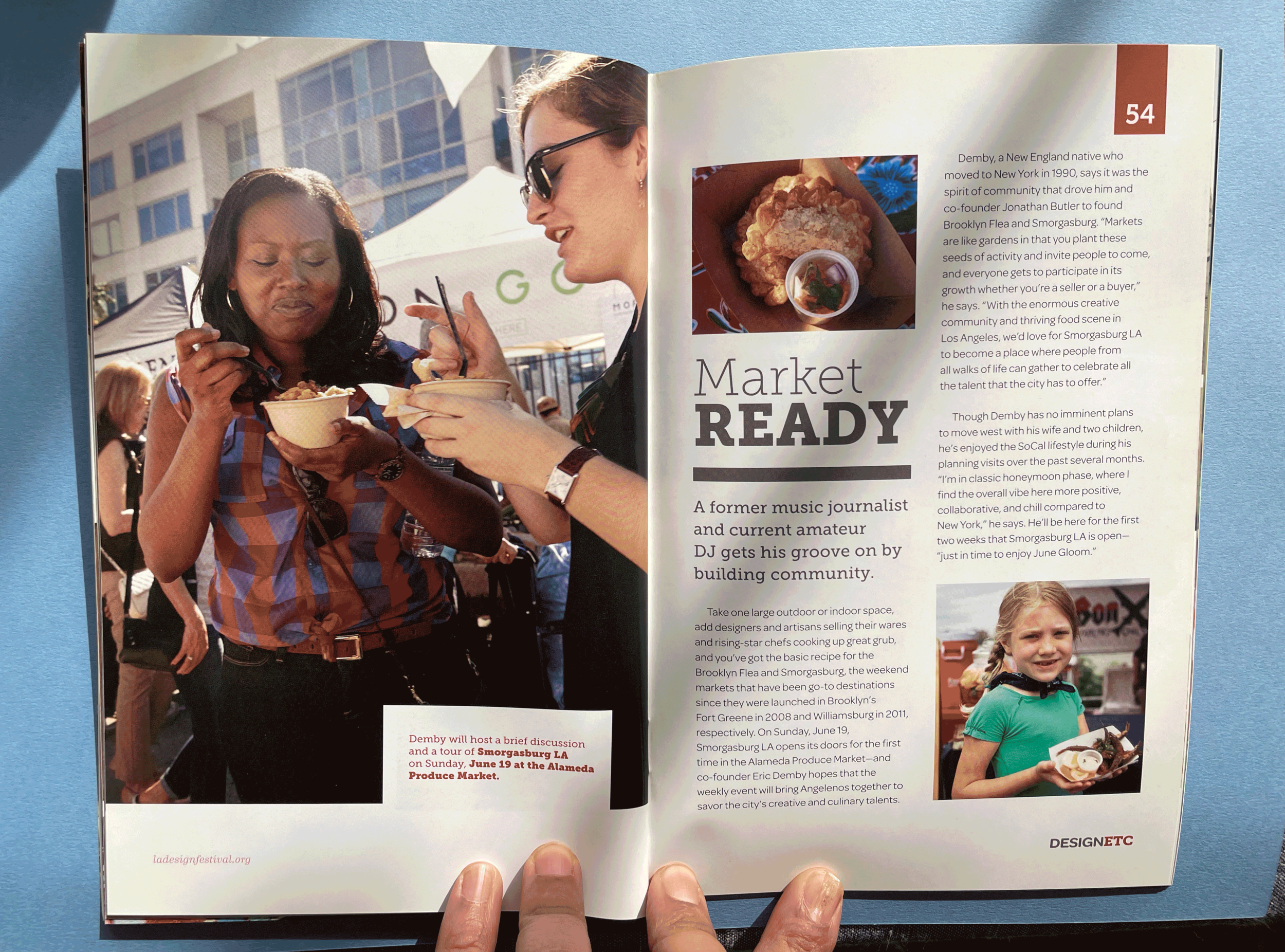
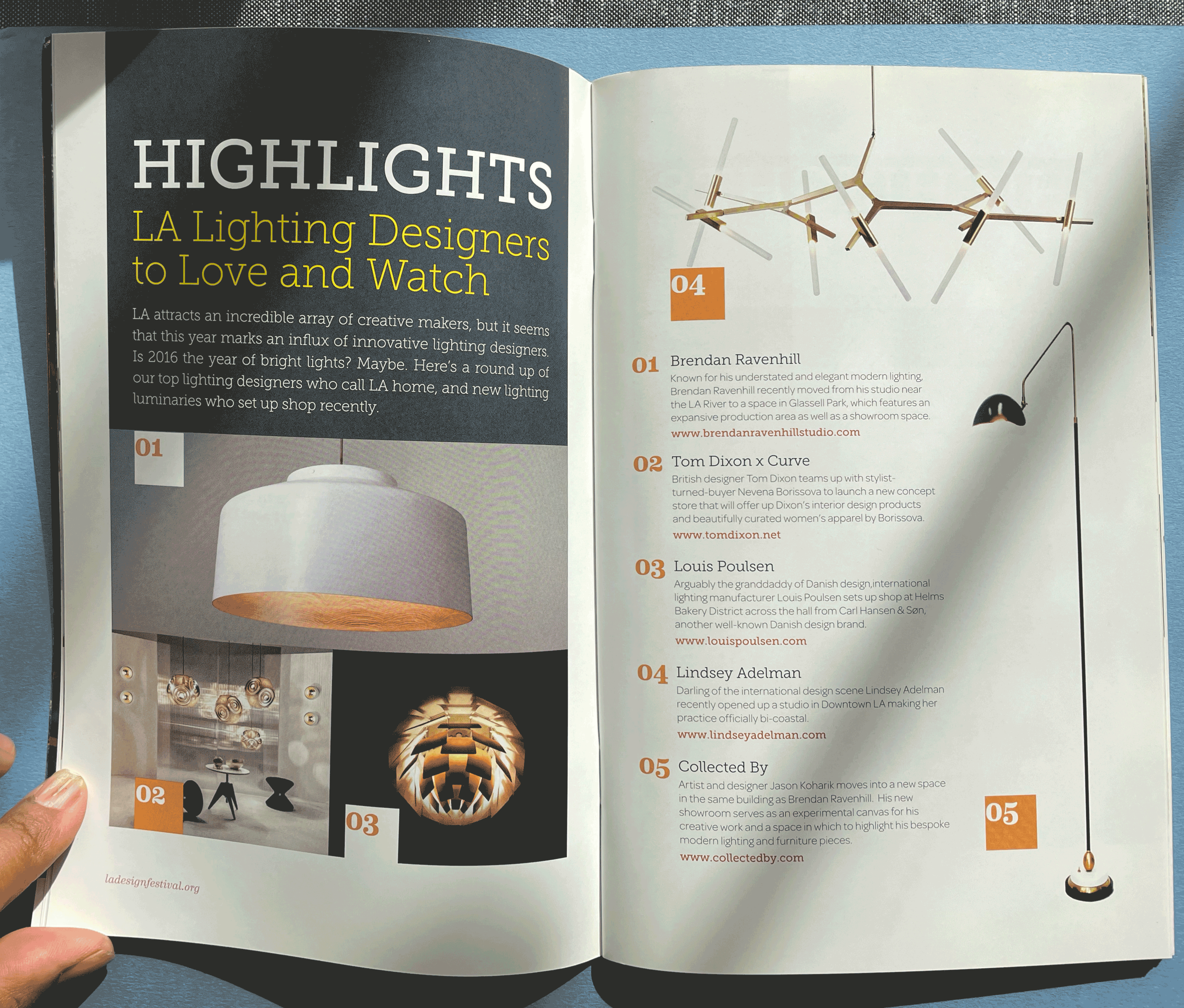
Working with festival founder Haily Zaki at Secret Agent, I designed the visual identity for the LA Design Festival. As the festival grew, the branding evolved from a more expressive approach to a cleaner, more modern identity that reflected its focus on Los Angeles design and architecture. The printed guides show how that identity changed over time.
THE GUIDE
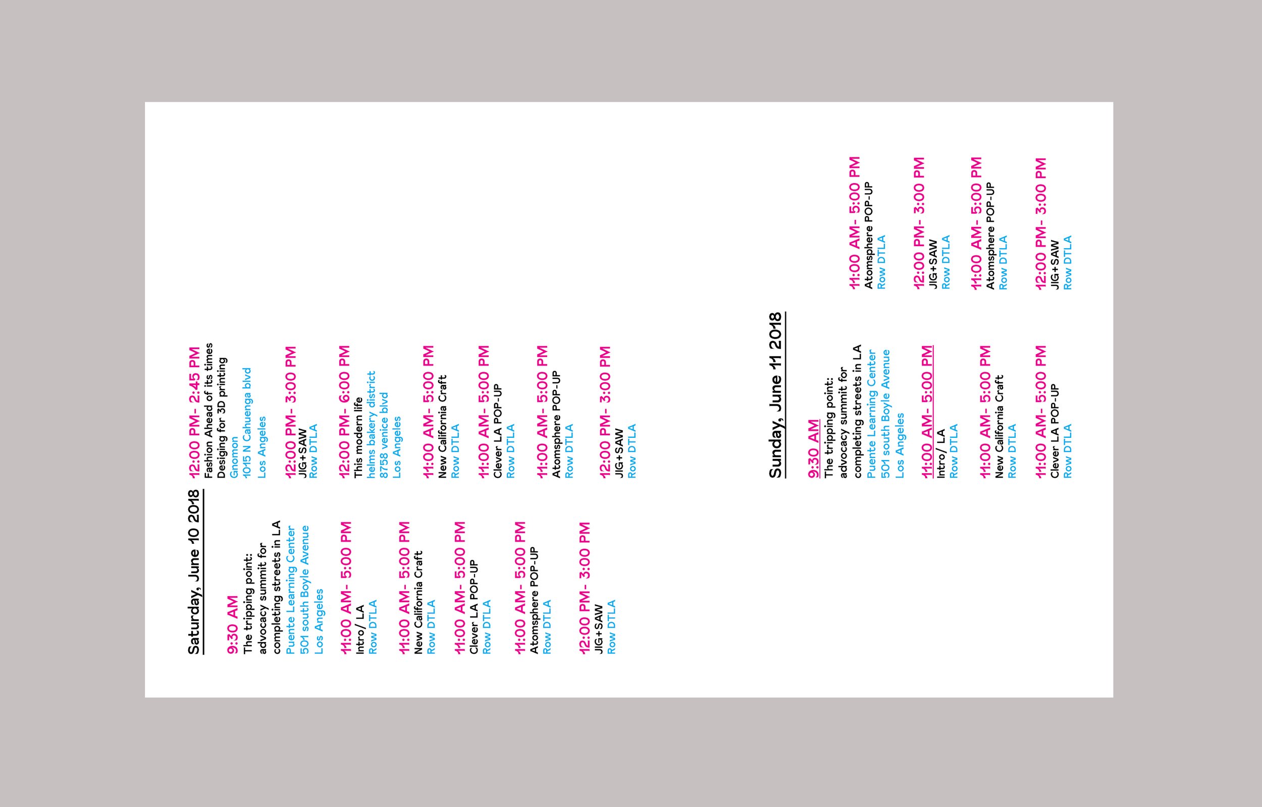
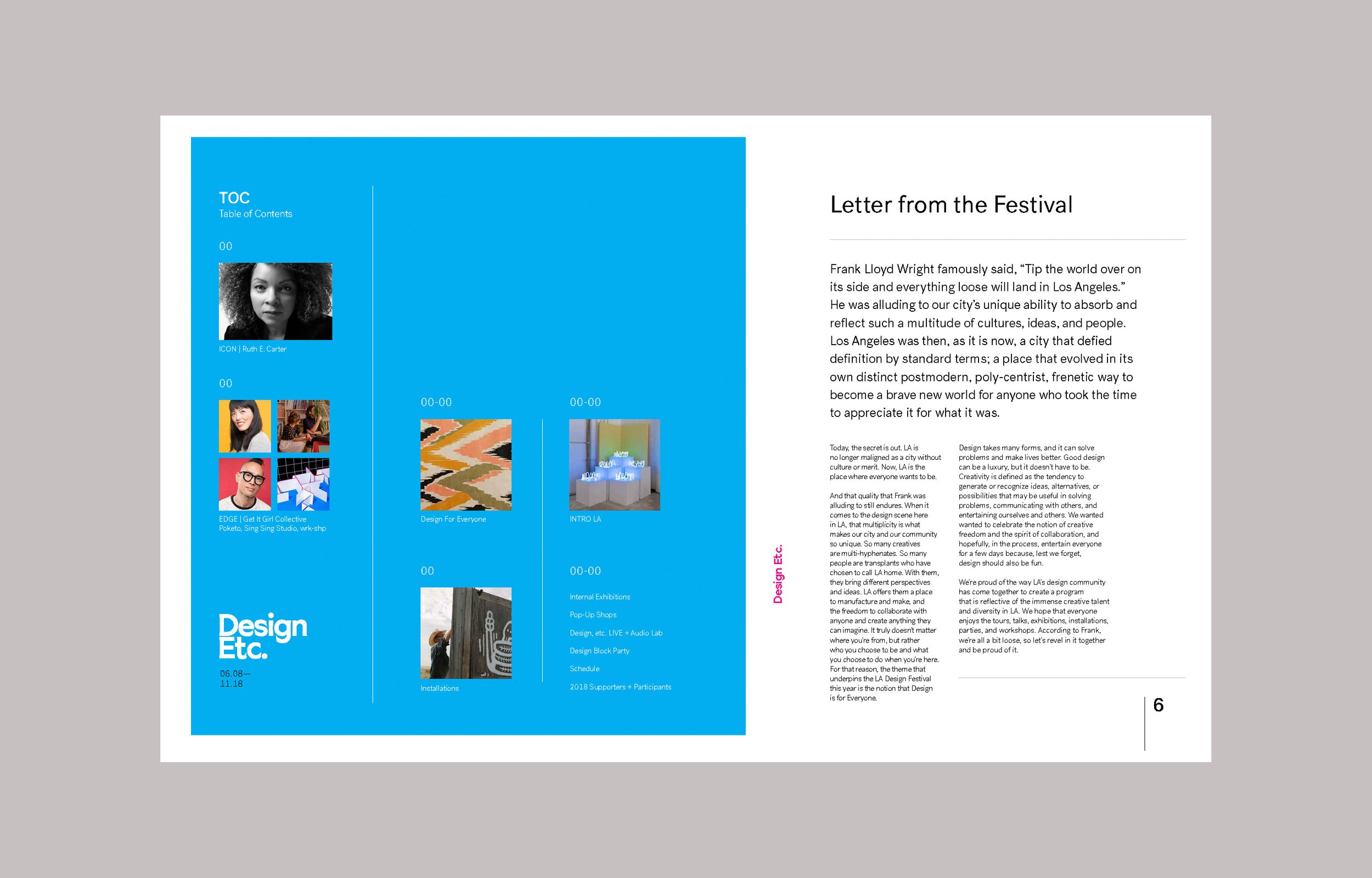
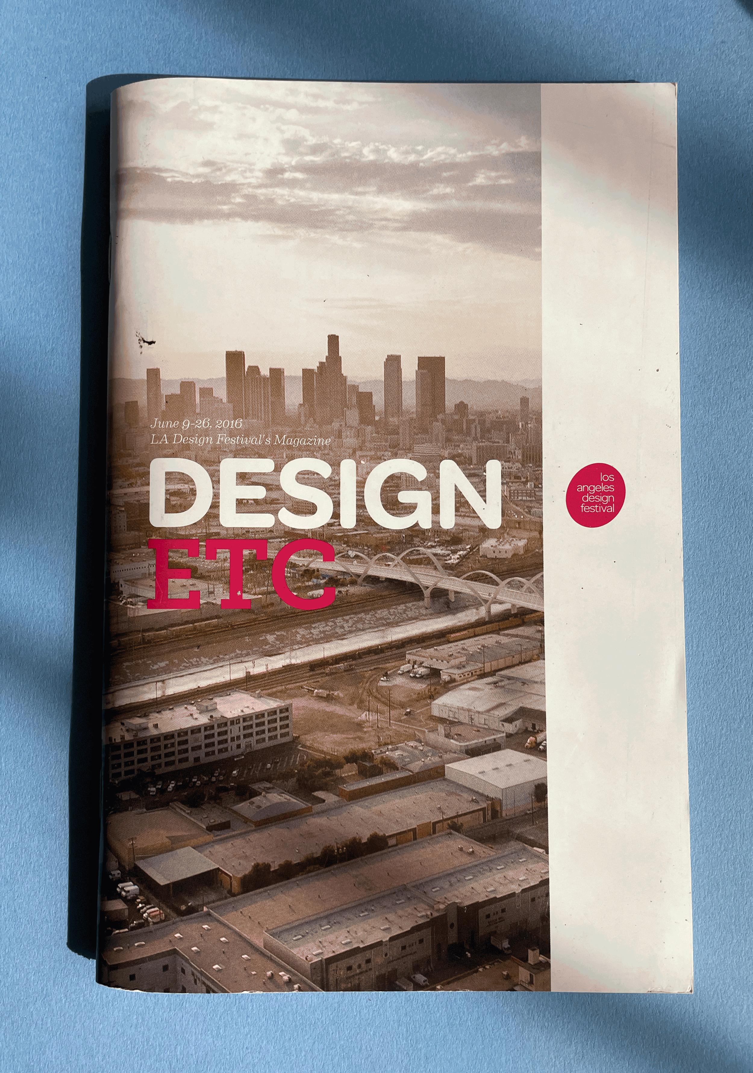
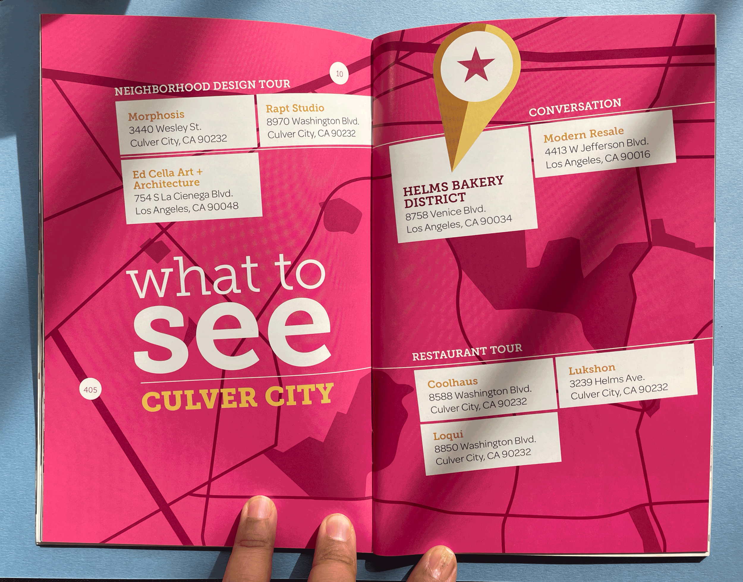
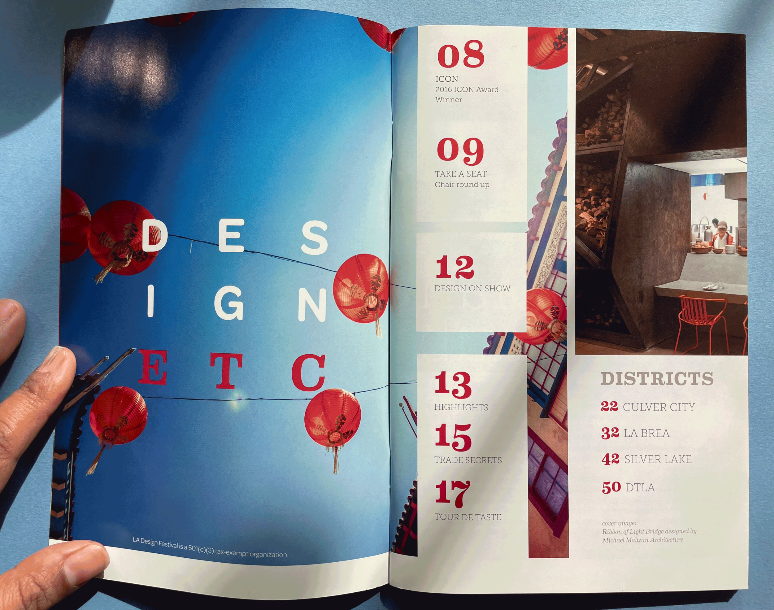
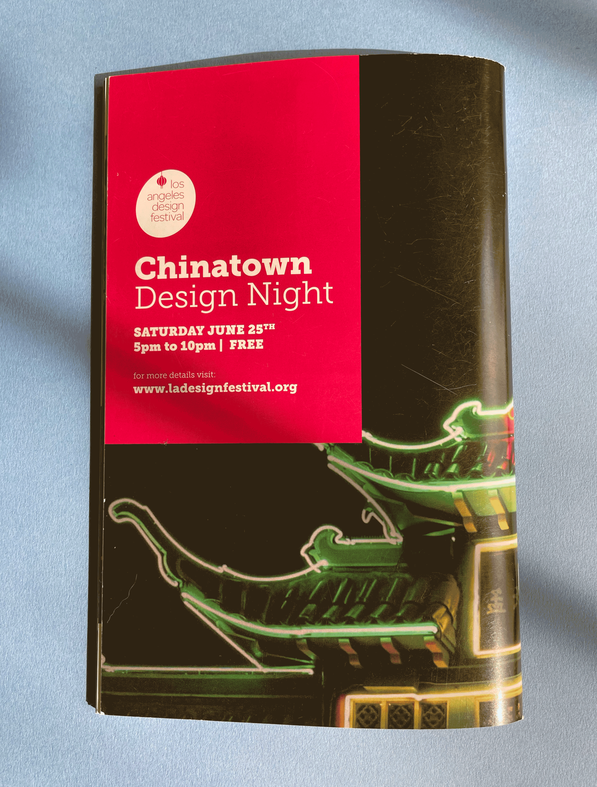
The festival guide was one of the event’s most important printed pieces, helping visitors navigate exhibitions, talks, and events across Los Angeles. Working with a budget of less than $2,000, I designed a compact, digitally printed booklet that was easy to use and affordable to produce.
THE NEWSPAPER
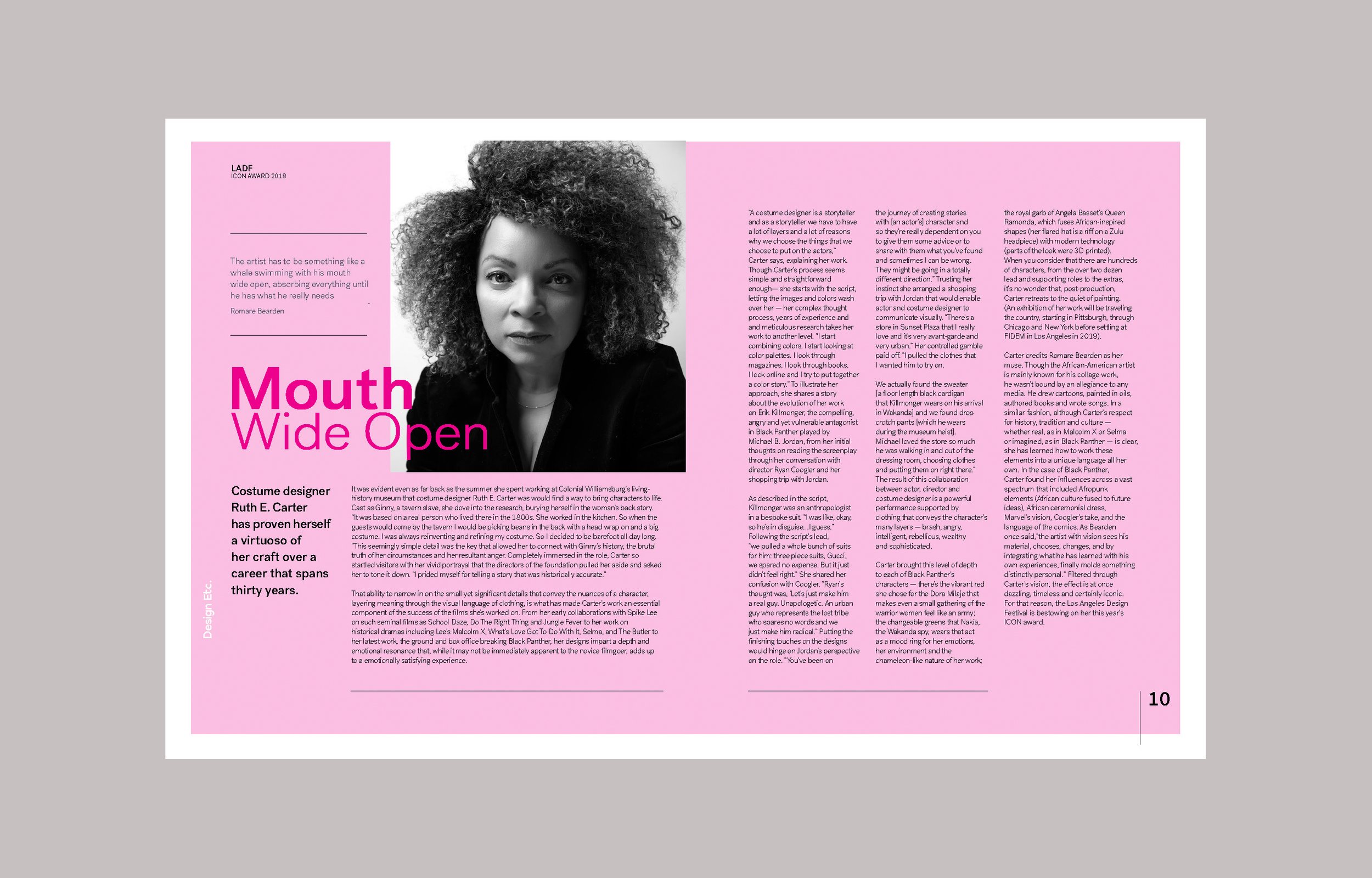
As the festival expanded, we refreshed the visual identity to better reflect its growing focus on modern design and architecture. I art directed the newspaper-style guide, working with a small design studio on its execution. The larger format gave us more room for editorial content and a cleaner, more graphic approach to the festival’s programming. Newsprint seemed like the obvious economical choice,
until we discovered how few printers still offered it. Not quite the cost-saving solution
we’d imagined.