

BRAND REFRESH
Healing Hands needed a more grown-up identity to reflect its sense of calm and
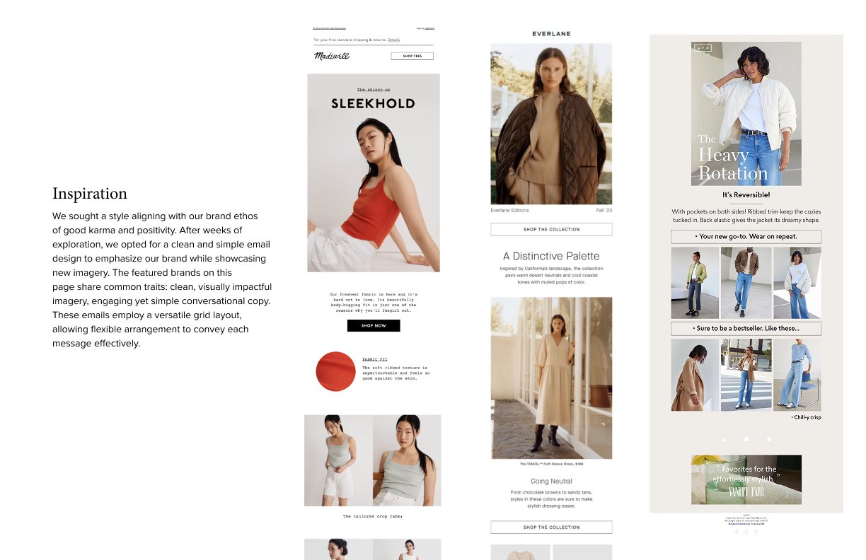
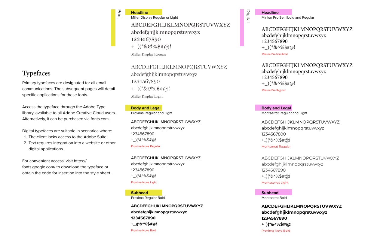
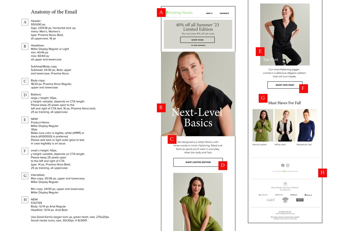
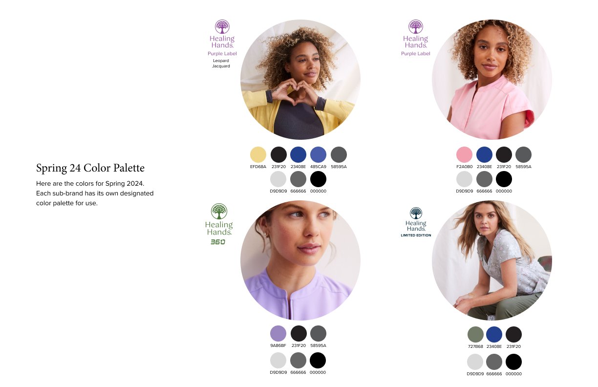
well-being. I refreshed the logo typography while keeping the original lotus tree mark, then developed a new color palette for the scrub collections. Each had its own colors, designed to work together when multiple collections appeared in retail signage, print, or digital. The signature lime green stayed
as an accent. The result was a more flexible identity that gave each collection its own personality while keeping the family resemblance.

-
![]()
Healing Hands Brand Guide SP '24 cover
-
![]()
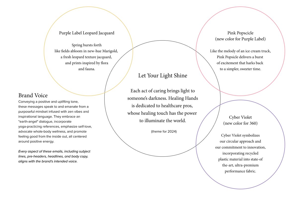
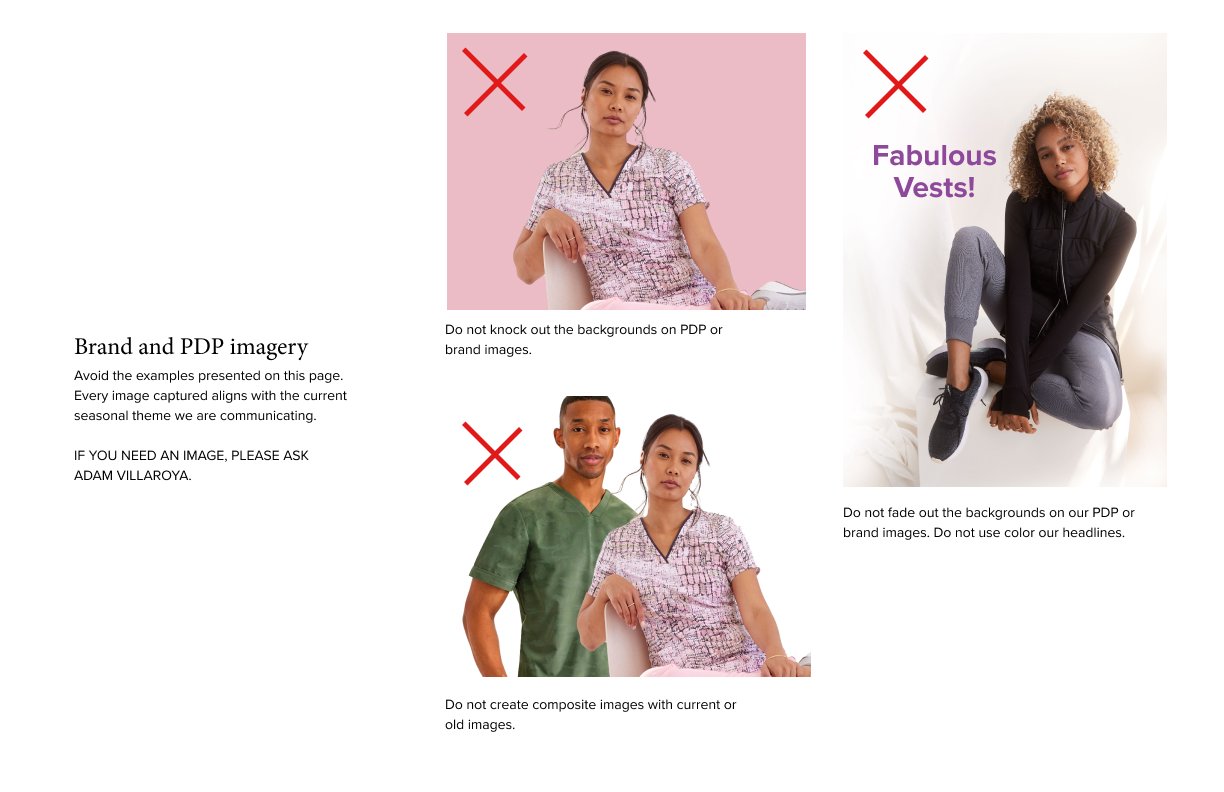
Healing Hands Brand Guide SP '24 p1
-
![]()
Healing Hands Brand Guide SP '24 p2
-
![]()
Healing Hands Brand Guide SP '24 p3
-
![]()
Healing Hands Brand Guide SP '24 p4
-
![]()
Healing Hands Brand Guide SP '24 p5
-
![]()
Healing Hands Brand Guide SP '24 p6



HH Limited Edition-Spring 24
HH Limited Edition Summer 24
HH Purple Label Spring 24
HH 360 Summer 24